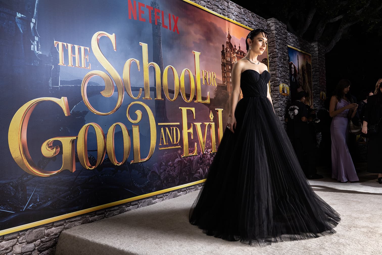
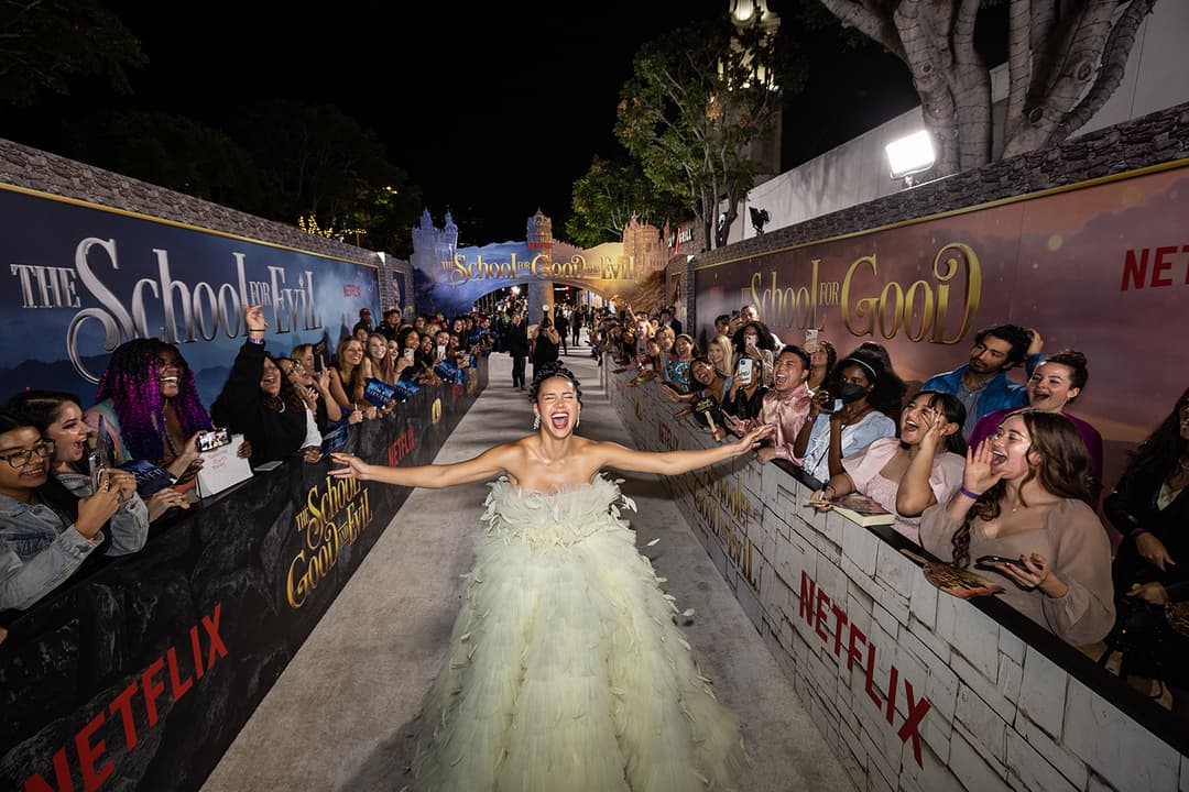
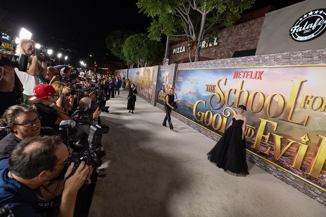
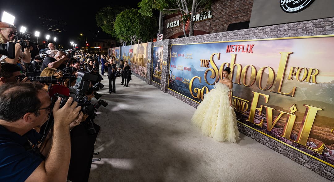
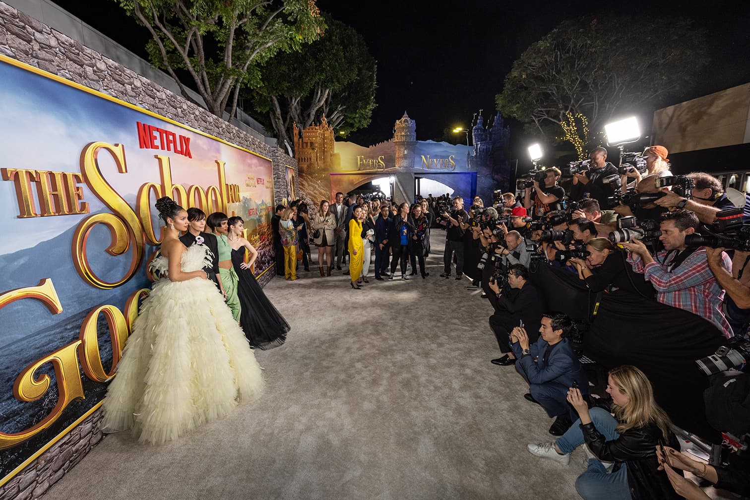
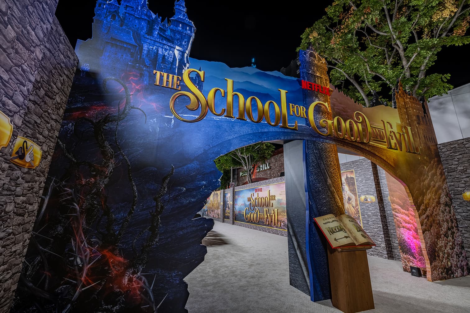
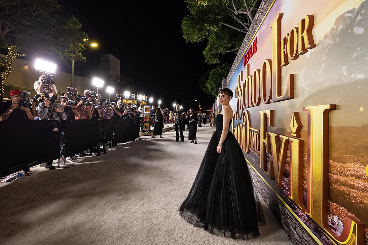
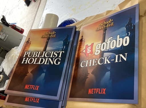
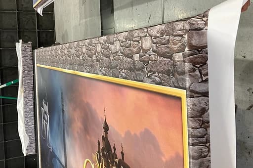
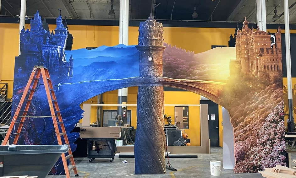
On-site production for the Netflix premiere of The School for Good and Evil — coordinating installation, staging, and event-day execution for a major studio premiere, the same disciplines applied across every other premiere and event below.
High-resolution production photography from the premiere: staging, installation detail, and event environment — the physical-production counterpart to the digital and packaging work shown elsewhere on this site.
Title letters measured, plotted, CNC-cut, and vinyl-wrapped for The Gray Man launch event — shown here from raw, in-progress production through to the finished signage on-site at the event itself.
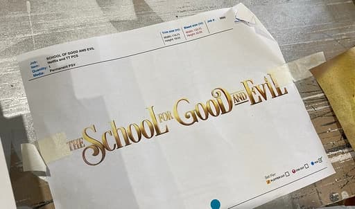
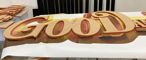
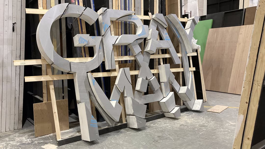
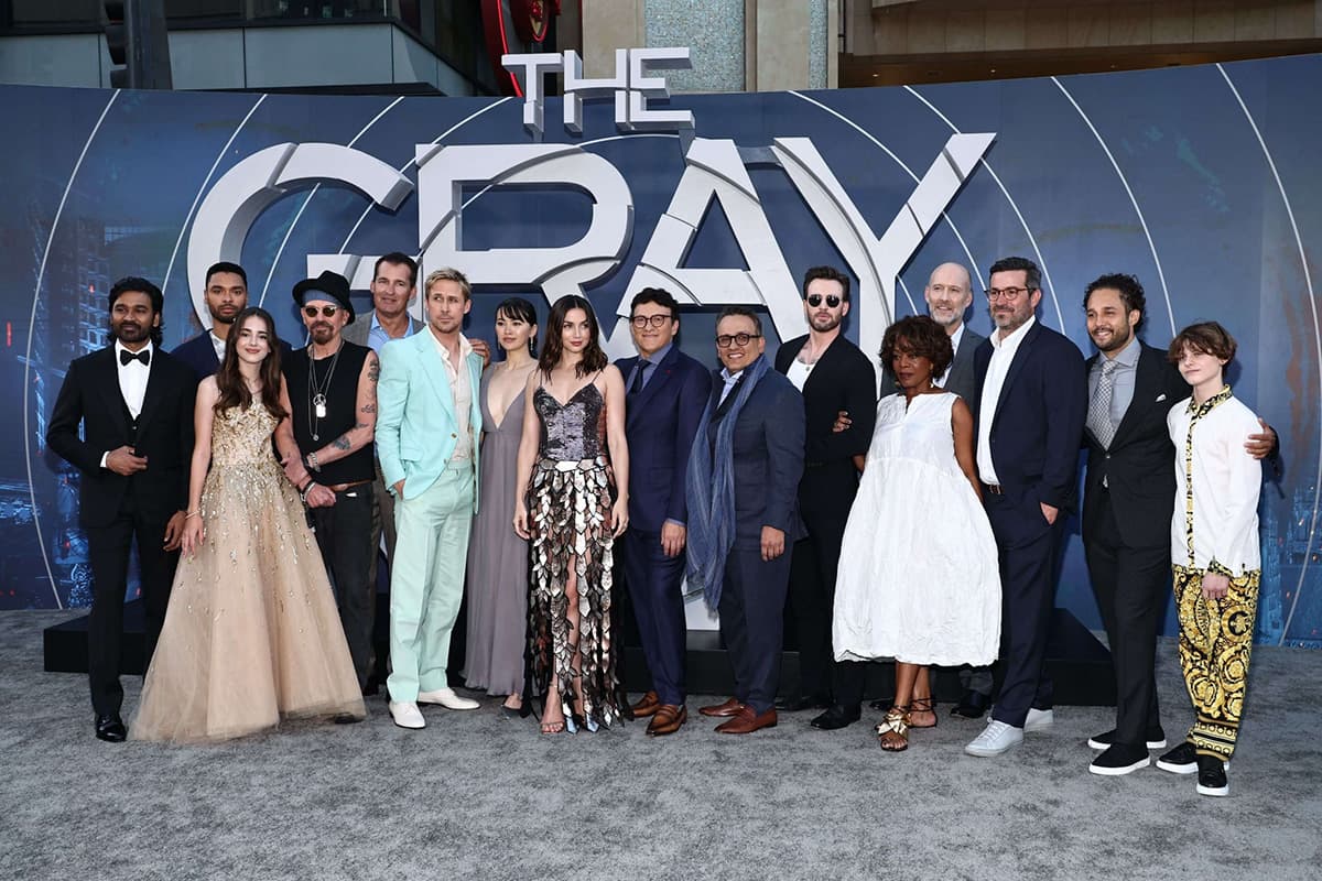
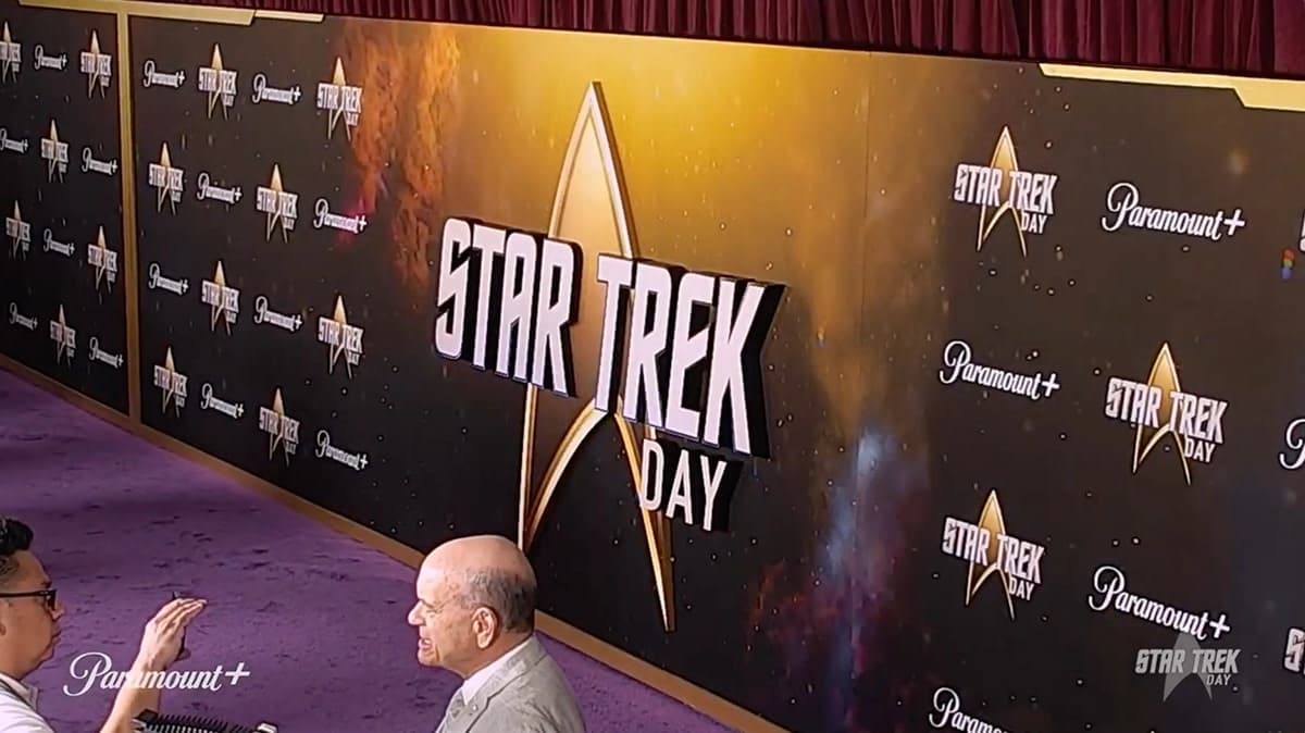
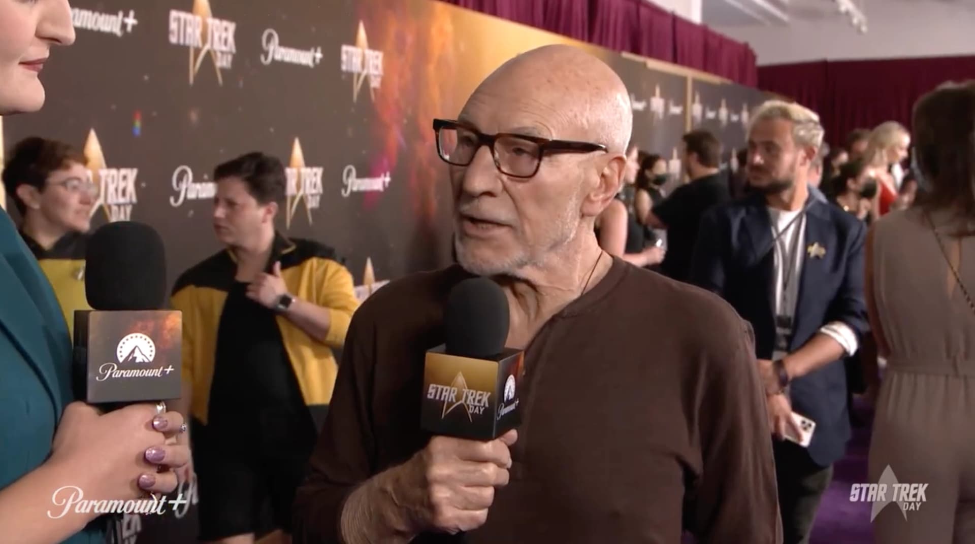
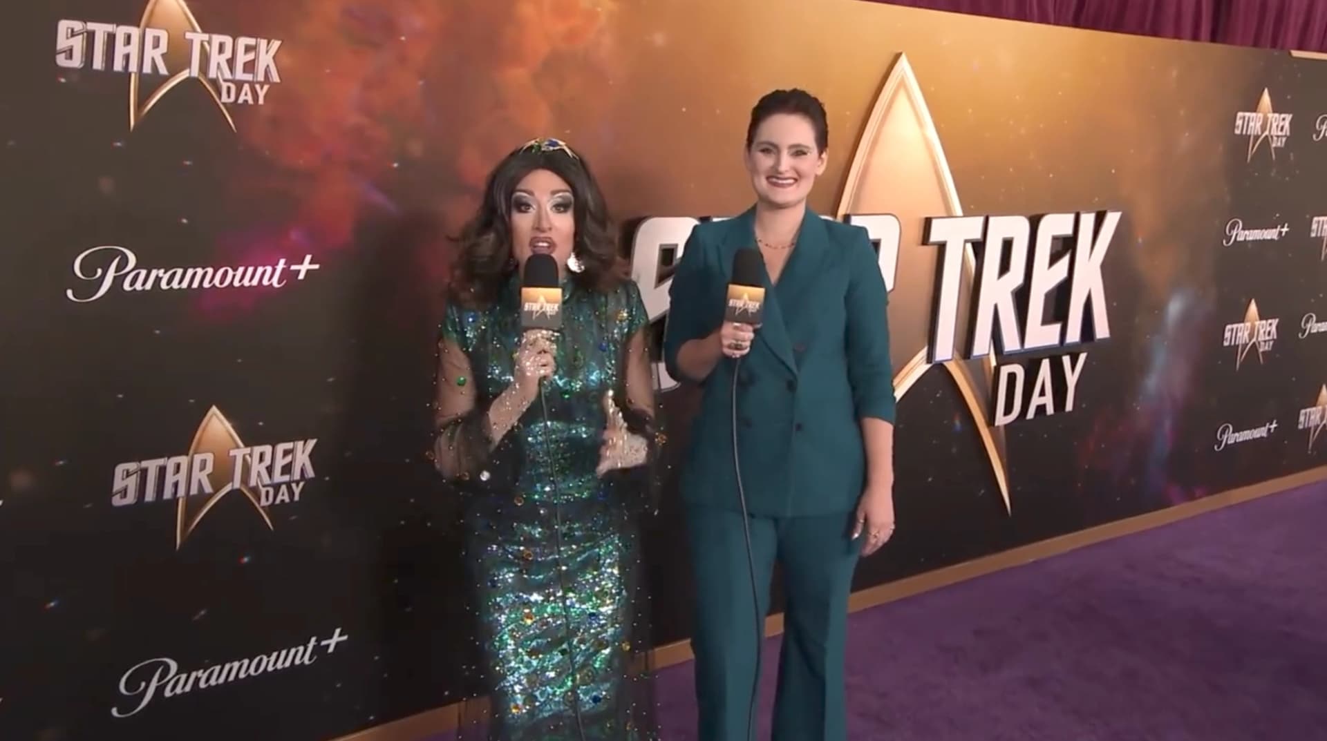
A dimensional title treatment for the Star Trek Day 2022 step & repeat — planned, CNC-cut, and produced under very close oversight from producers and studio teams, where every measurement and material choice had to hold up to studio-level scrutiny before it ever reached the carpet.
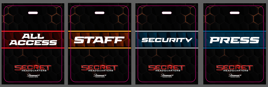
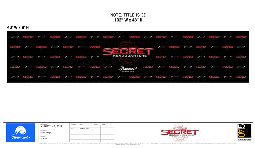
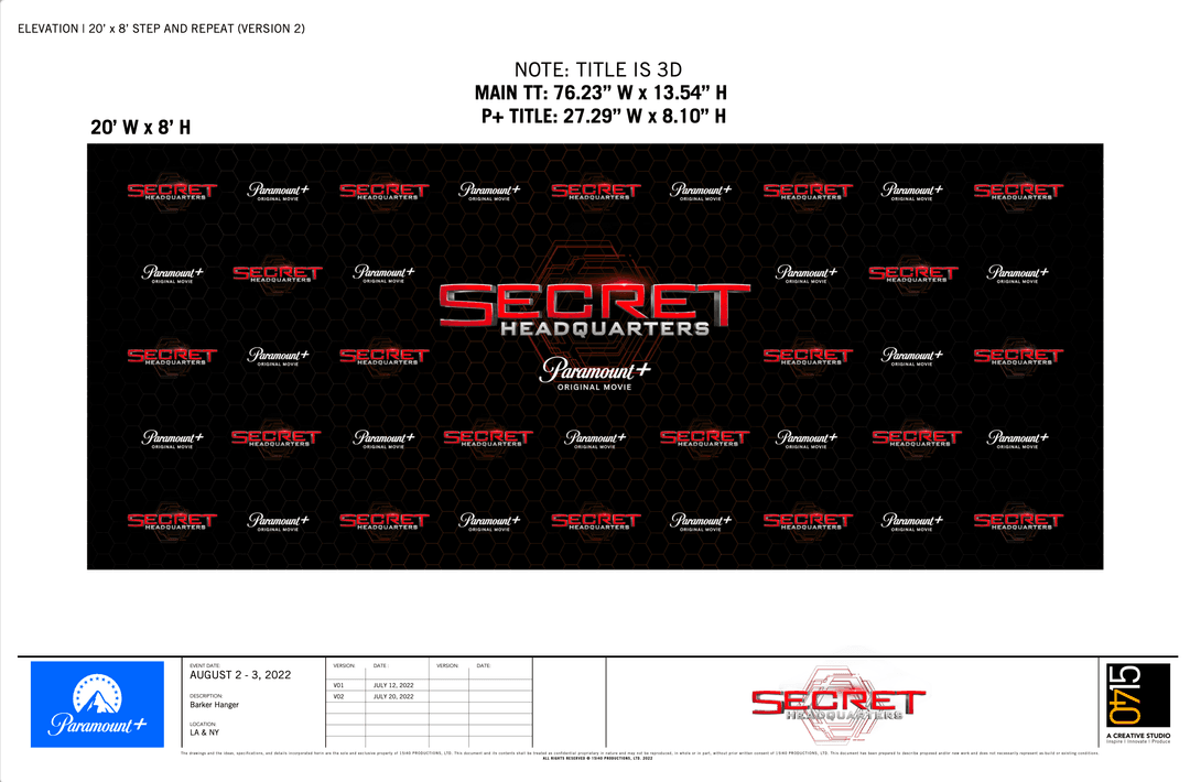
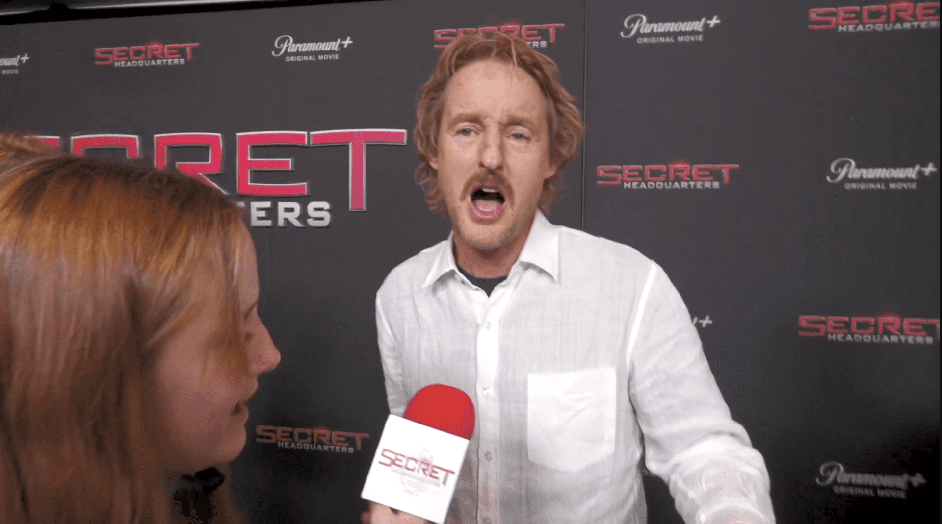
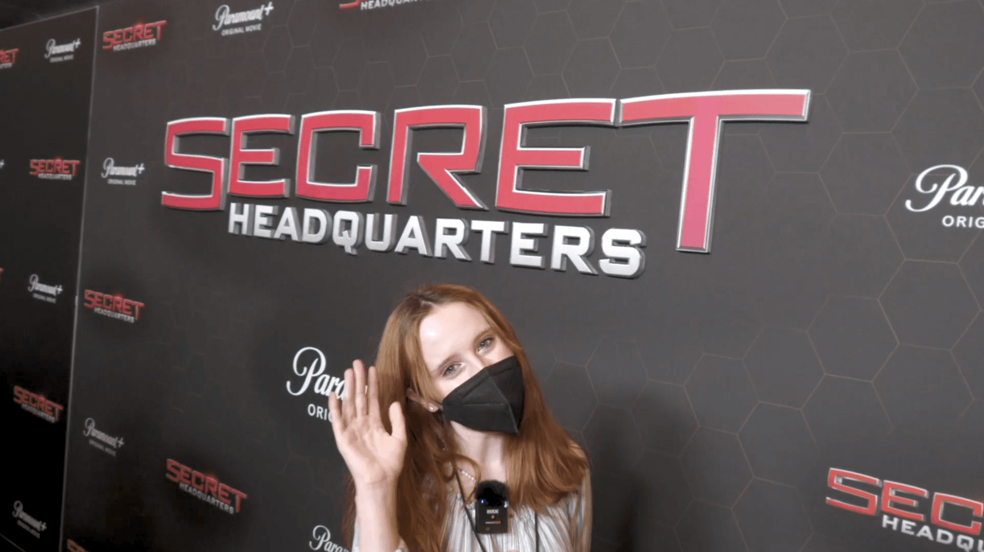
Production artwork for the Secret Headquarters movie premiere credential system, including All Access, Staff, Security, and Press badges, designed as a coordinated set using the event’s branding, color coding, typography, and logos. The build also included design and production elevations for both a 40′ × 8′ and a 20′ × 8′ step & repeat wall — repeating the Secret Headquarters and Paramount+ branding over a custom hexagonal background with an enlarged, dimensionally-mounted central title treatment — and the completed interview wall and dimensional 3D title installation seen at the event itself.
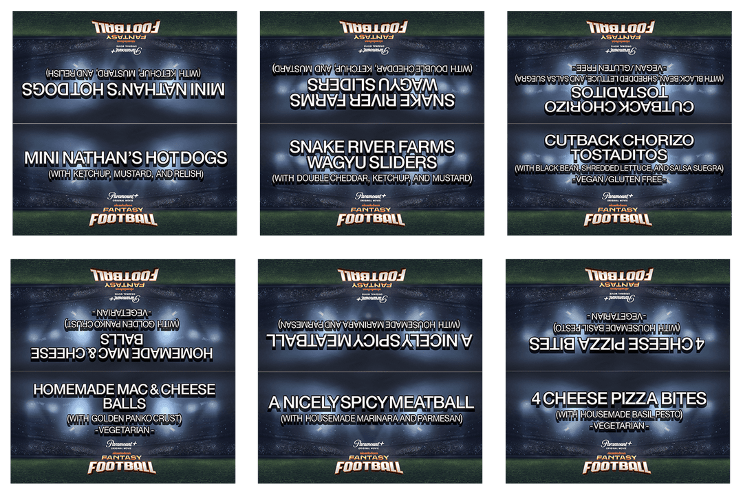
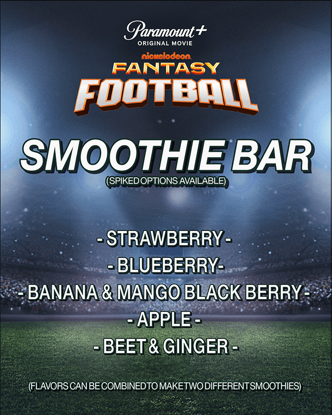
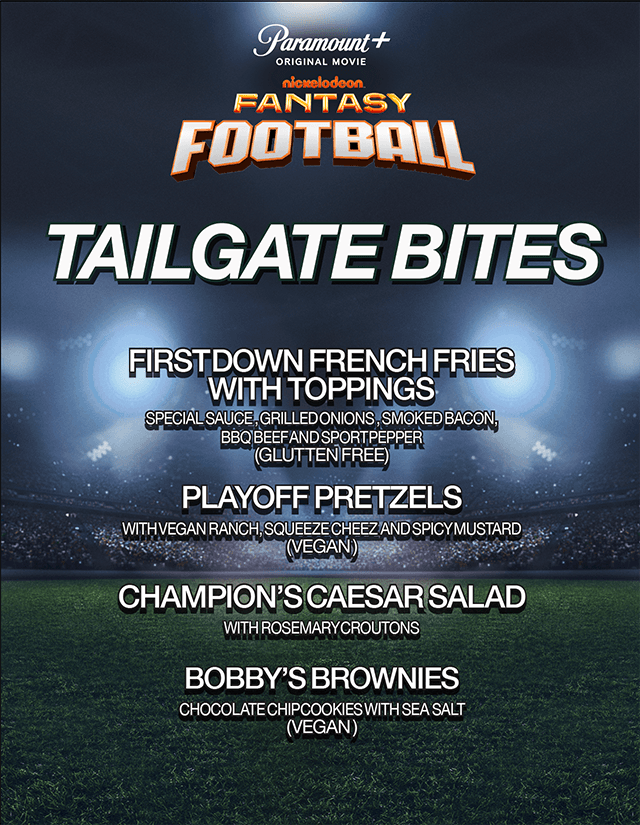
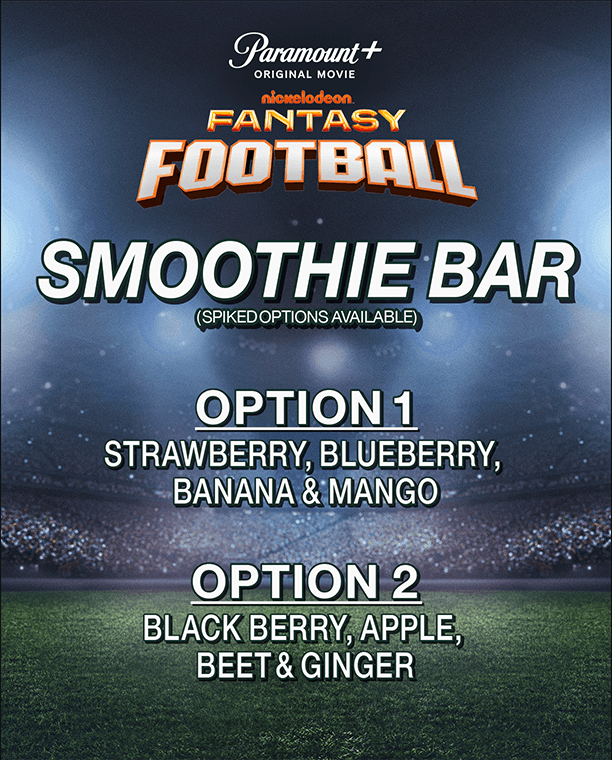
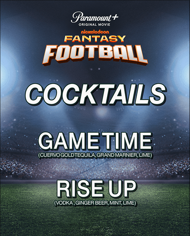
A complete environmental graphics package for the Fantasy Football premiere events in Los Angeles and Atlanta — step & repeat walls (including the LA green-carpet arrivals backdrop), food and beverage signage across Tailgate Bites and the Smoothie Bar, reserved-parking signage color-coded for Press, Guest, Talent, and Staff, freestanding “lollipop” signs, and guest table tents — all built from supplied Paramount+ and Fantasy Football key art into a single coordinated visual system across every touch point of the event.
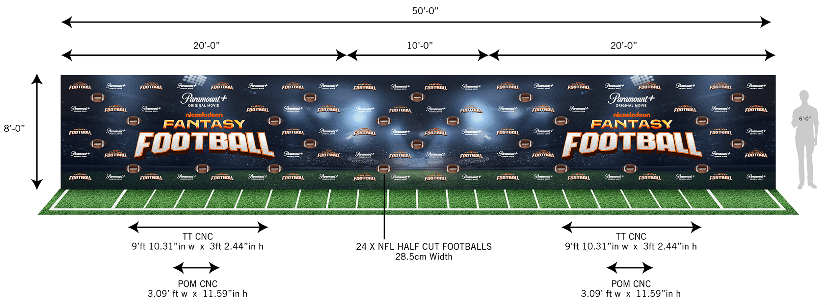
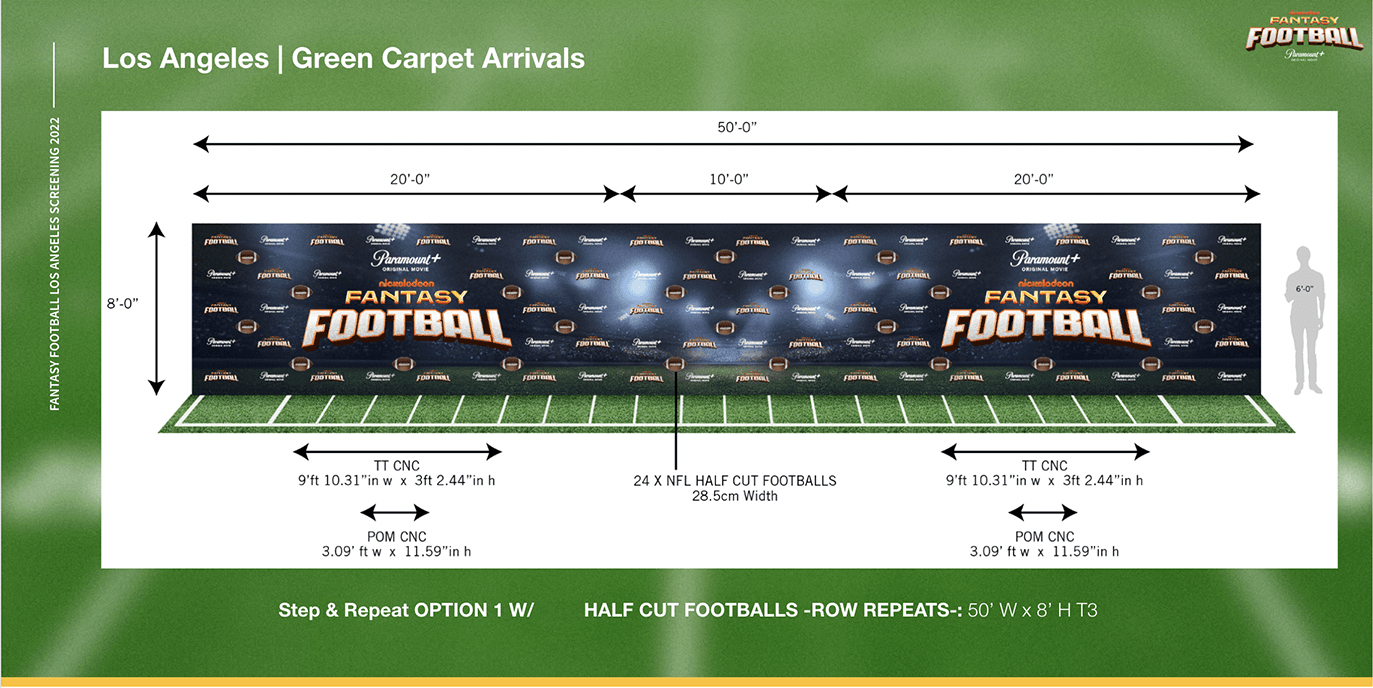

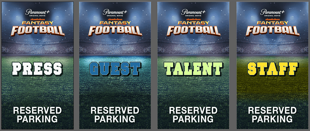
“Lollypop” signage produced repeatedly across events using studio-provided key art assets as the source material for each deliverable, alongside dye-sublimation printed walls fitted into place alongside wrapped trusses and structural elements — the physical build-out that turns key art into a walkable event environment.
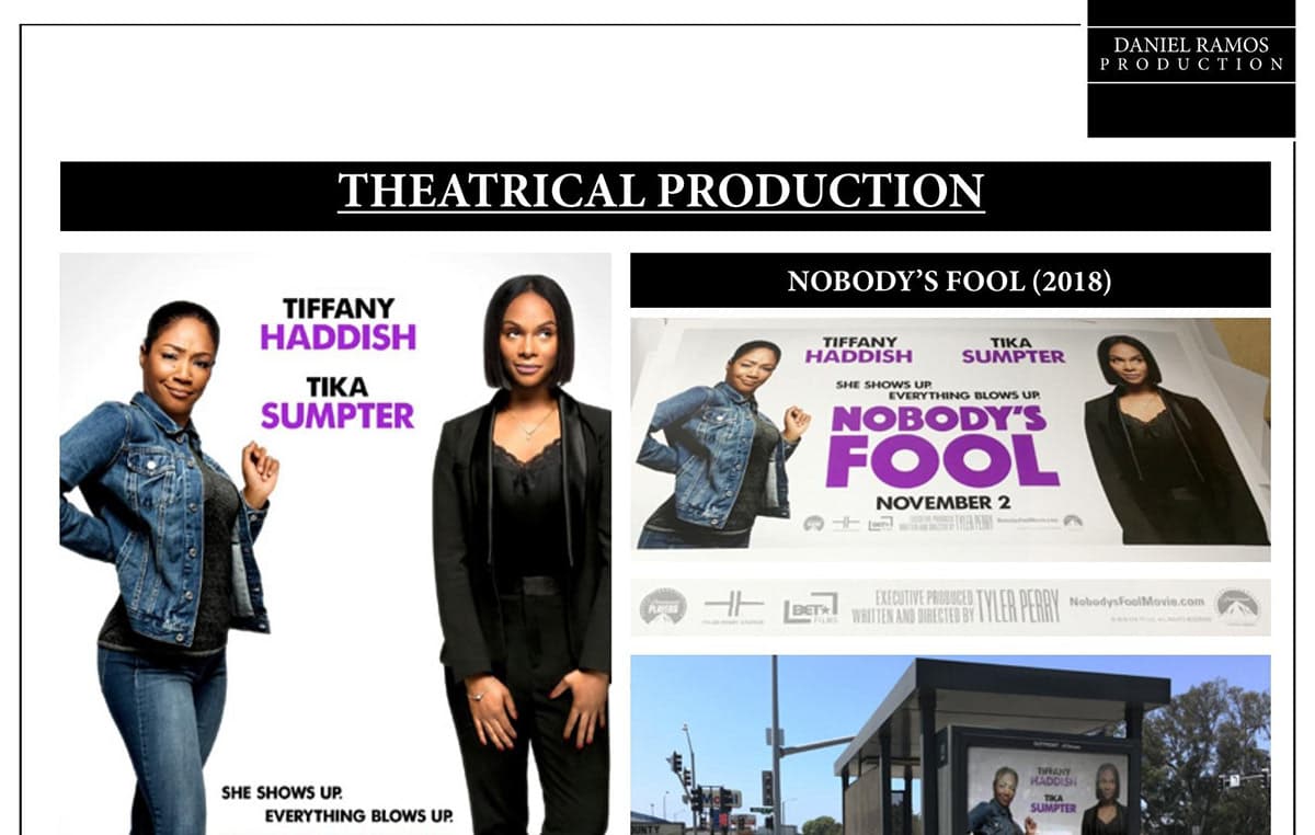
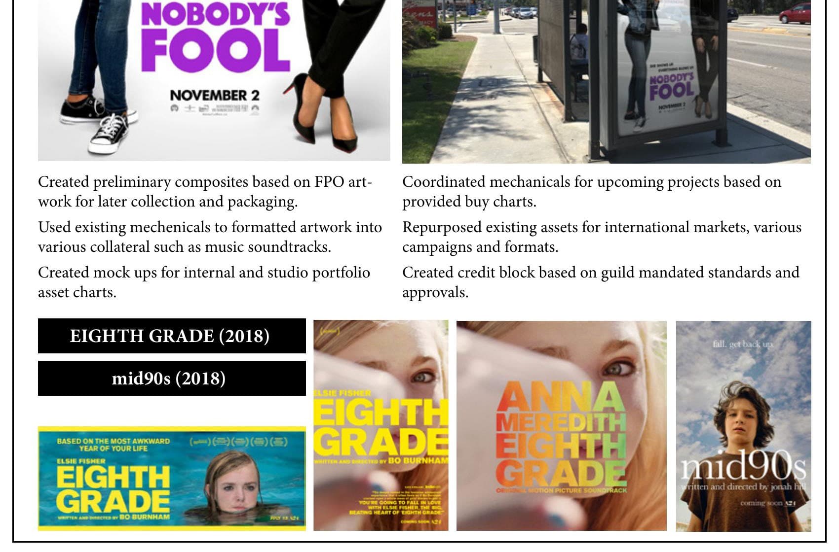
Beyond physical builds, this work included producing title bugs, handling final press, running final regional checks, and clarifying color and spec across revisions — in some cases with the authority to recomposite materials that couldn’t be reshot directly. That same trust extended to coordinating industry-standard rollouts for assets like music soundtracks and archived web banners, and providing media materials directly to Rotten Tomatoes and other critics and outlets as a trusted distribution source — which is also why some of the images shown here are lower-resolution: self-procured under real access restrictions, not stock photography.