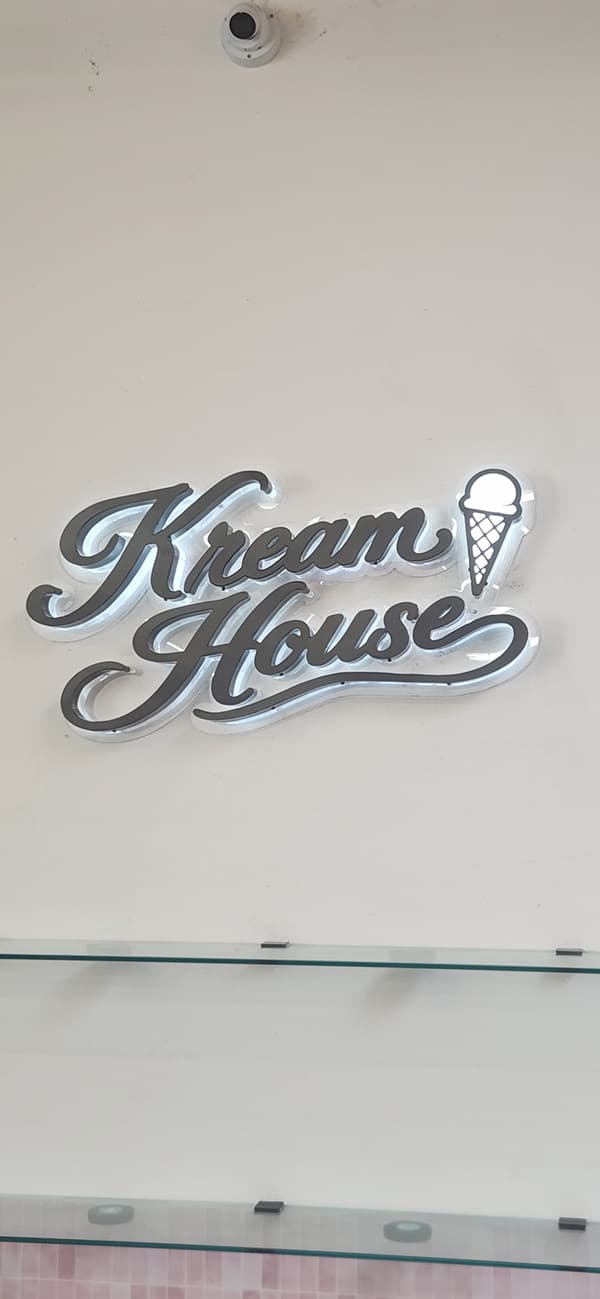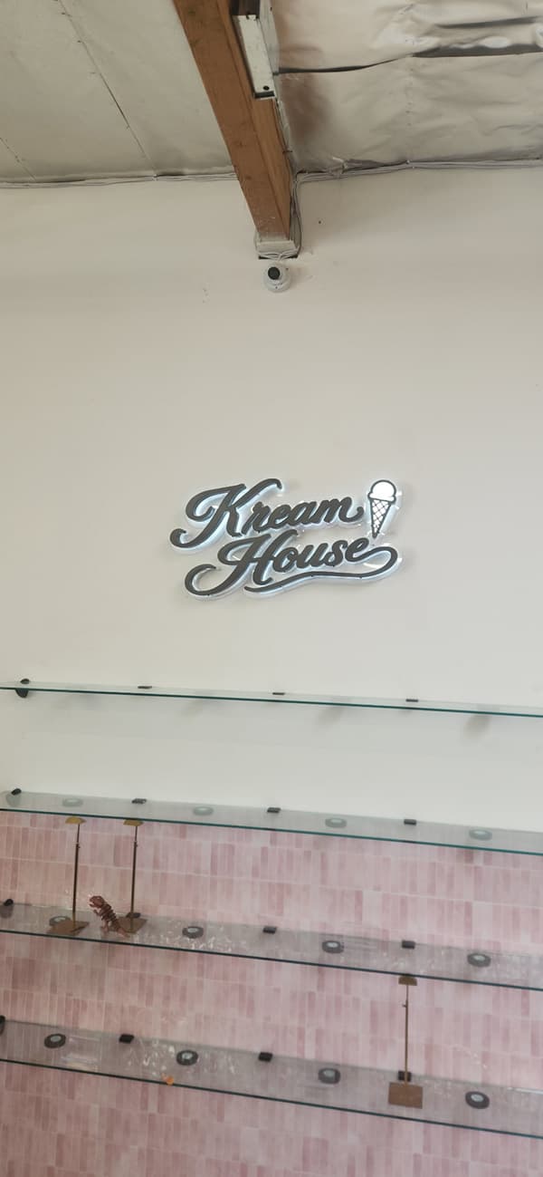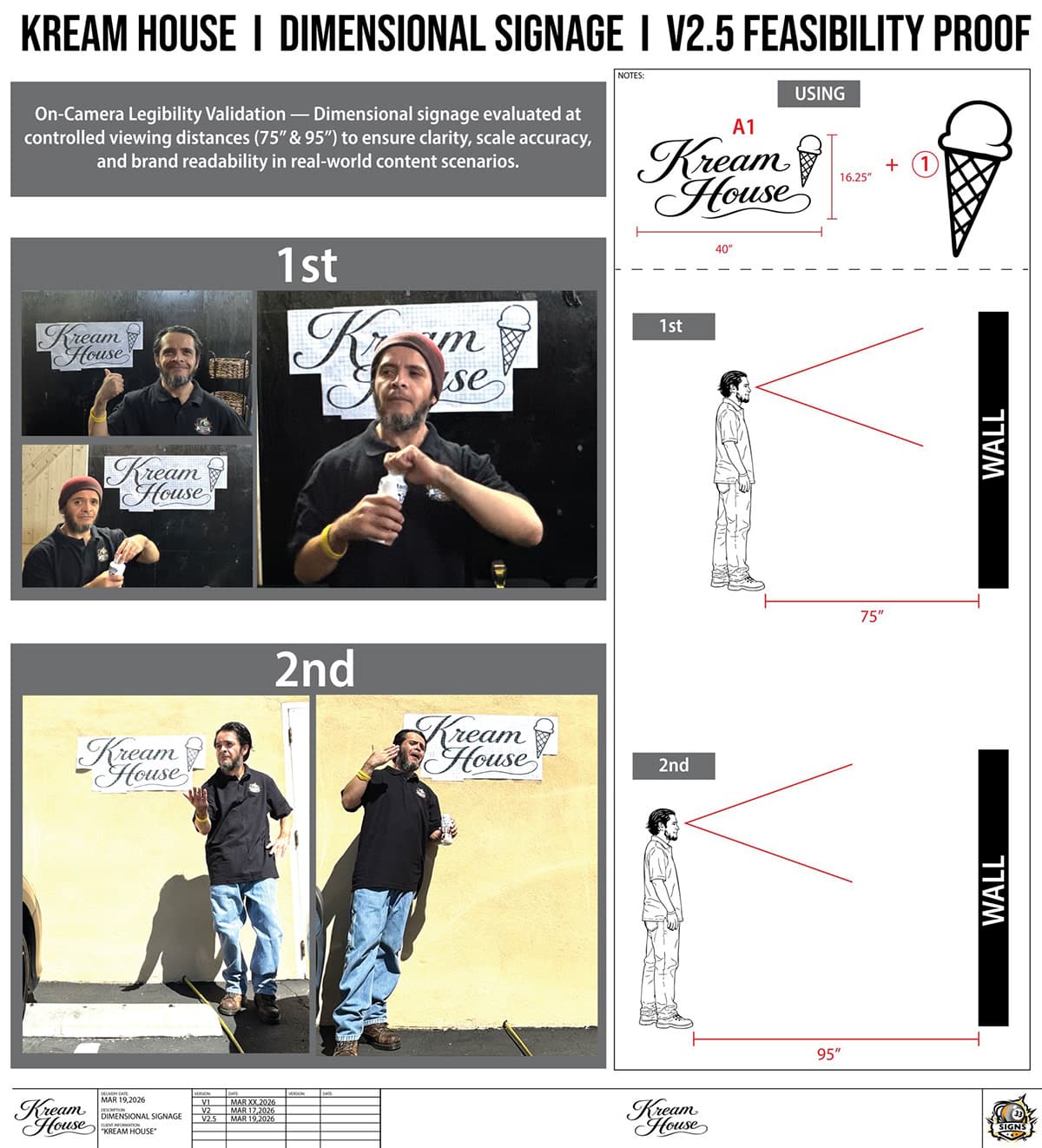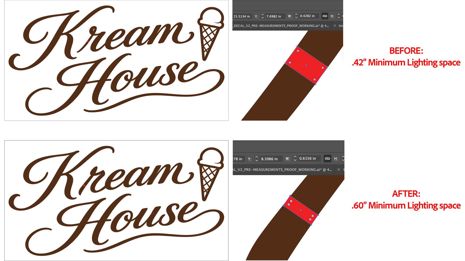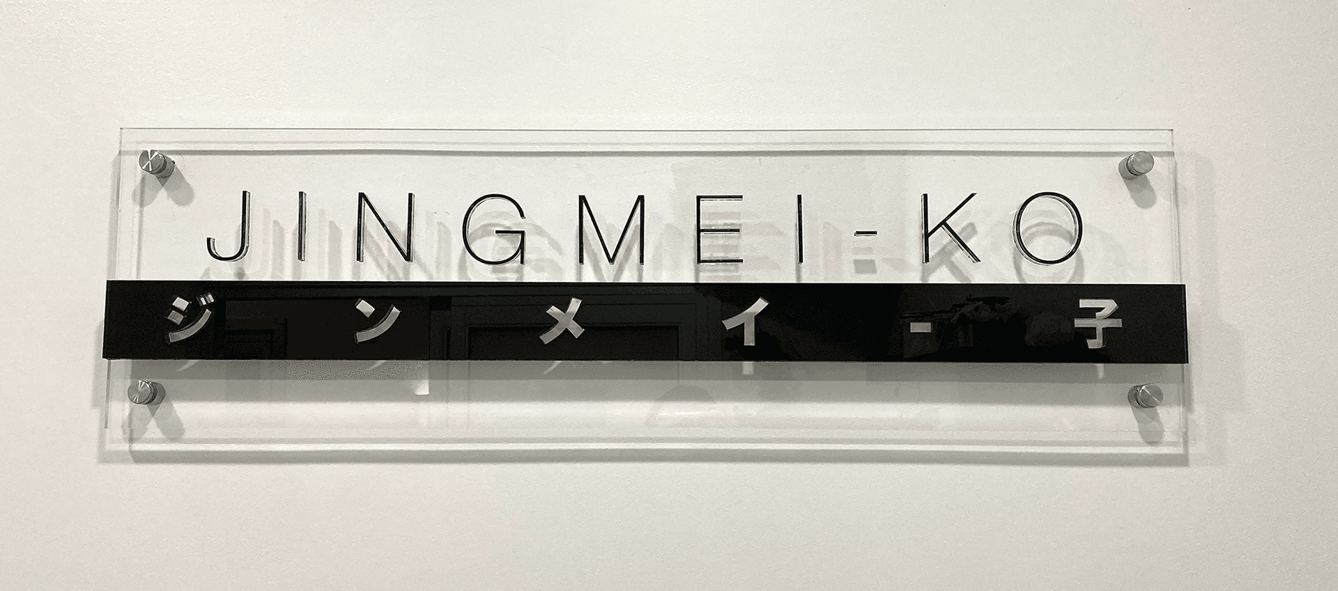
Taking a brand’s identity into physical space — from concept through fabrication proofs to the finished, installed sign. Two projects, same process: Beauty by JingMei-ko’s storefront signage and Kreme House’s dimensional sign.
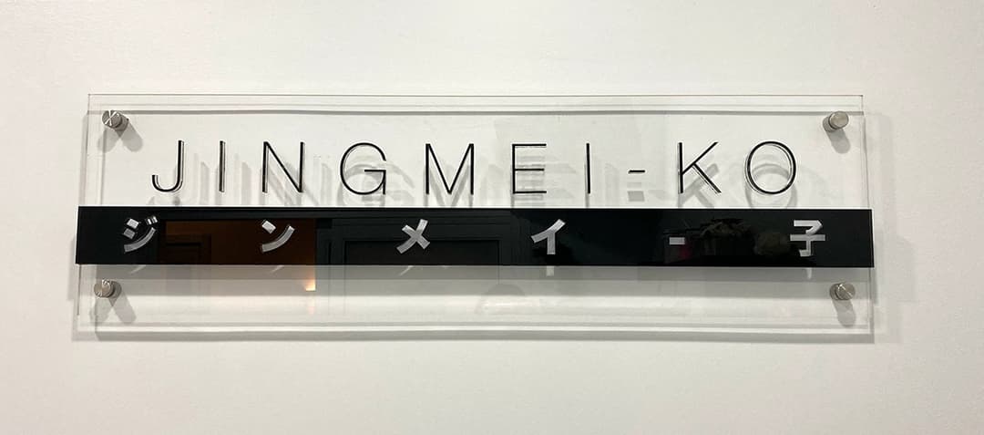
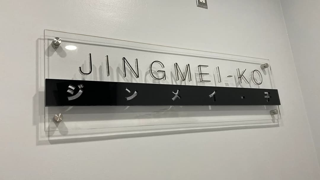
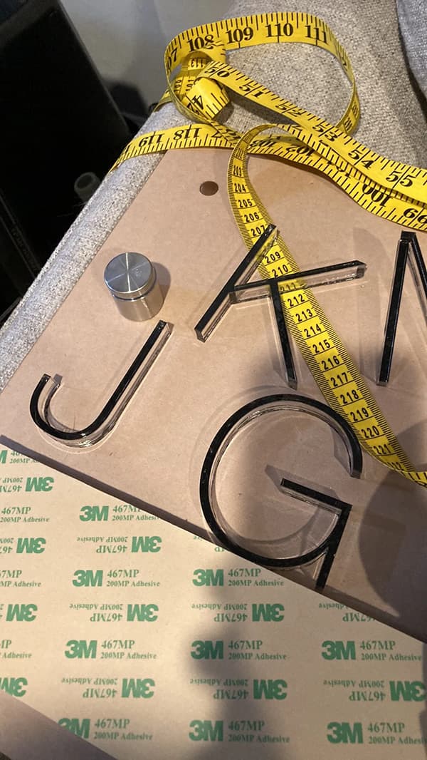
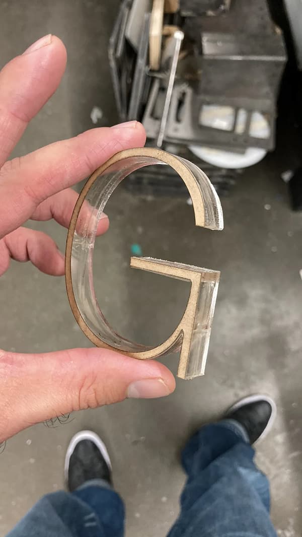
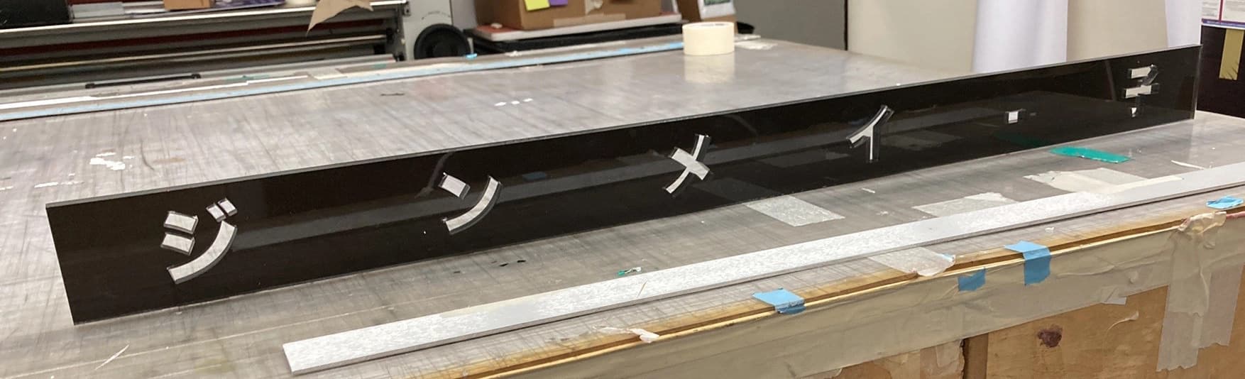
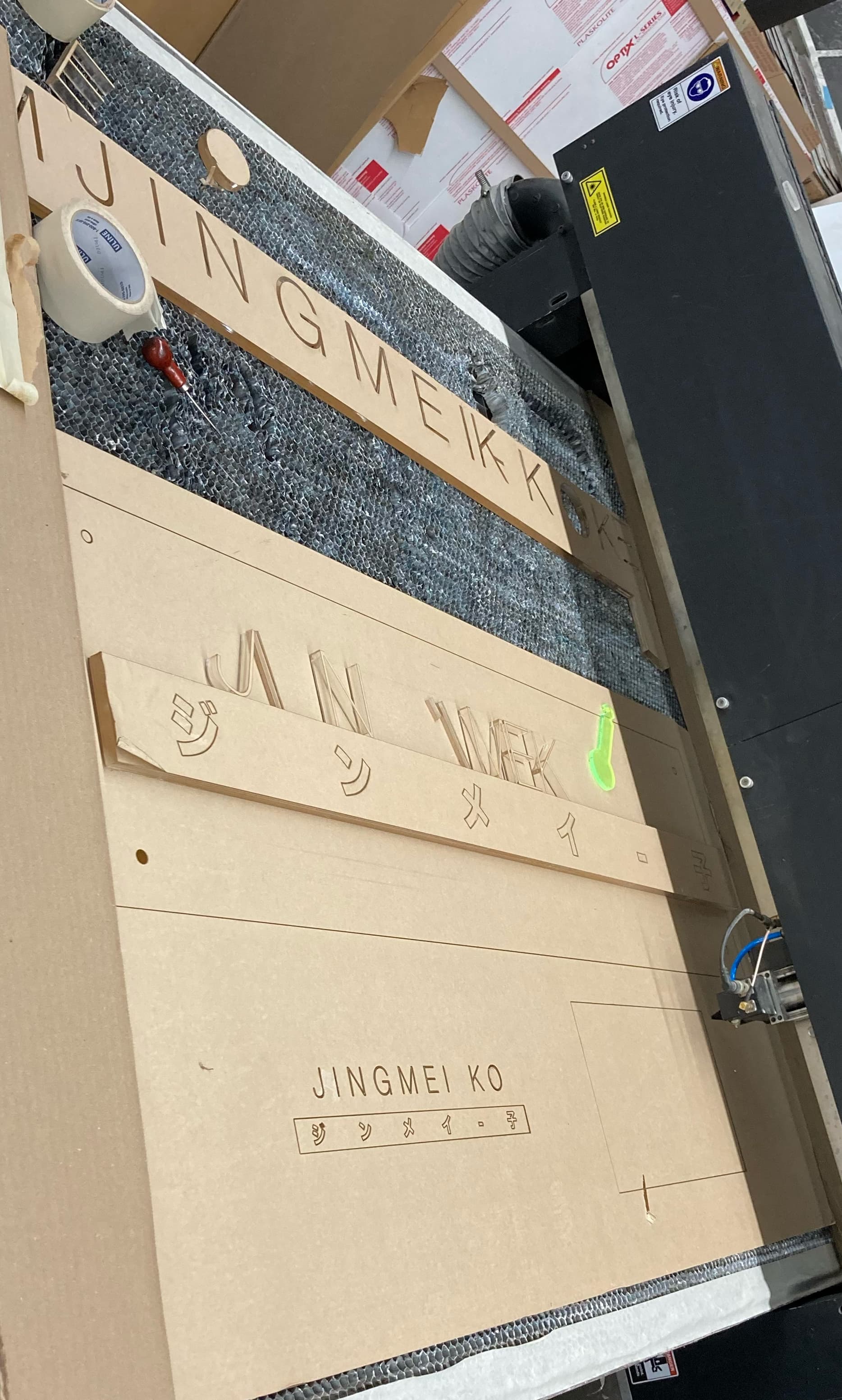
The salon’s brand identity translated into a dimensional storefront sign — shown here from raw fabrication through to the finished, installed piece and an alternate angle showing how it reads in context on the storefront.
A dimensional sign built for Kreme House, shown here across the full process — the fabrication proof used during planning, a farther-out reference shot showing the sign in its real environment, and the finished, installed piece.